Tablists are used to divide complex page content into smaller, more manageable sections. Each section is represented by a tab label that allows users to display one panel at a time. In this sense, tablists can be understood as small, self-contained page fragments within a larger page.
Tablists are well known as native controls in many operating systems: a list of controls (usually on top of the element) allows to toggle the visibility of corresponding panels. Only a single control can be active at a time, so exactly one panel is visible and all others are hidden.
We use the term tablist instead of simply tabs to avoid confusion with the Tab key used for keyboard navigation.
In particular, a compliant tablist must fulfil the following criteria:
The purpose and usage of the tablist must be clearly understandable.
The active and inactive states of tabs must be visually and programmatically perceivable.
Users must receive clear feedback when a tab is activated.
The tablist must be fully operable using:
keyboard only,
screen readers (desktop and mobile),
standard interaction keys (Tab, Enter/Space, Home/End, arrow keys).
Panel content must be easily accessible via keyboard and assistive technologies.
Similarities with accordions and carousels
Although tablists, accordions, and carousels appear visually different, they all address the same fundamental use case: controlling the visibility of related content sections.
Tablists provide the most basic pattern: one active panel at a time.
Carousels extend this pattern with previous/next controls and optional autoplay.
Accordions stack controls and panels vertically and may allow multiple panels to be open simultaneously.
Because of these similarities, many of the following principles also apply to:
ARIA-based tablists are well supported across modern browsers and assistive technologies. When native HTML elements cannot express the required behaviour, an ARIA-based implementation is recommended.
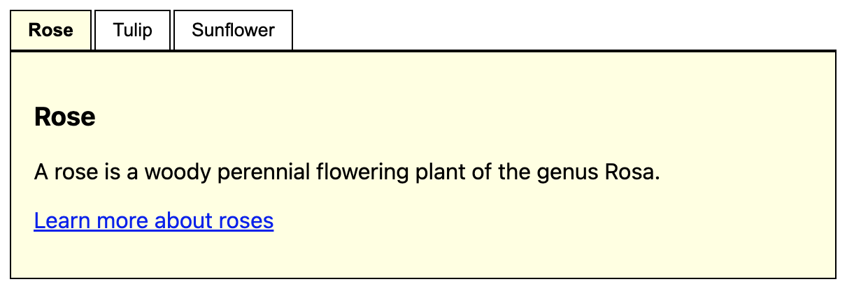
<p><button>Focusable element before</button></p><sectionclass="tablist-widget"><h2id="flowers-heading">Flowers</h2><divrole="tablist"aria-labelledby="flowers"class="tablist"><buttonrole="tab"id="t1"aria-controls="p1">Rose</button><buttonrole="tab"id="t2"aria-controls="p2">Tulip</button><buttonrole="tab"id="t3"aria-controls="p3">Sunflower</button></div><divrole="tabpanel"id="p1"aria-labelledby="t1"><h3>Rose</h3><p>A rose is a woody perennial flowering plant of the genus Rosa.</p><p><ahref="https://en.wikipedia.org/wiki/Rose"target="_blank">Learn more about roses</a></p></div><divrole="tabpanel"id="p2"aria-labelledby="t2"hidden><h3>Tulip</h3><p>Tulips are a genus of spring-blooming perennial plants.</p><p><ahref="https://en.wikipedia.org/wiki/Tulip"target="_blank">Learn more about tulips</a></p></div><divrole="tabpanel"id="p3"aria-labelledby="t3"hidden><h3>Sunflower</h3><p>A sunflower is a large annual plant.</p><p><ahref="https://en.wikipedia.org/wiki/Sunflower"target="_blank">Learn more about sunflowers</a></p></div></section><p><button>Focusable element after</button></p>
Activation logic ensures that only the selected panel is visible at a time.
Inactive panels are hidden using the hidden attribute to ensure proper support in assistive technologies.
In some implementations, tab elements use display: block (instead of inline-block) to improve navigation in NVDA browse mode.
ARIA attributes establish clear relationships between tabs and panels.
POC #2: Radio buttons (Legacy)
Note: This approach is deprecated and provided for reference only.
The ARIA-based implementation (POC #1) should be used for all new projects, as it offers correct semantics and more reliable support for modern assistive technologies.
The radio button approach was previously used as a simpler alternative based on native form controls. However, radio buttons represent form input choices rather than navigational relationships between tabs and panels. This semantic mismatch leads to poorer screen reader support and inconsistent interaction patterns, requiring significant workarounds to achieve comparable accessibility.
<pstyle="background: #fff3cd; border: 1px solid #ffc107; padding: 8px; margin: 0 0 16px 0;"><strong>Deprecated:</strong> Use ARIA-based implementation instead. Radio buttons are unsuitable for tablists because they represent form input choices rather than navigational relationships between tabs and panels, leading to poorer screen reader support and inconsistent interaction.
</p><p><button>Focusable element before</button></p><divclass="tablist"><h1class="visually-hidden">
flowers (tablist)
</h1><pclass="visually-hidden">
Tablist help: use the tablist controls to toggle the visibility of their respective panels (below the controls).
</p><fieldsetclass="controls"><legendclass="visually-hidden">Tablist controls</legend><divclass="control"><inputchecked=""class="visually-hidden"id="tablist_flowers_panel_rose"name="tablist_flowers"type="radio"value="tablist_flowers_panel_rose" /><labelfor="tablist_flowers_panel_rose"><spanclass="visually-hidden">Show panel </span>Rose</label></div><divclass="control"><inputclass="visually-hidden"id="tablist_flowers_panel_tulip"name="tablist_flowers"type="radio"value="tablist_flowers_panel_tulip" /><labelfor="tablist_flowers_panel_tulip"><spanclass="visually-hidden">Show panel </span>Tulip</label></div><divclass="control"><inputclass="visually-hidden"id="tablist_flowers_panel_sunflower"name="tablist_flowers"type="radio"value="tablist_flowers_panel_sunflower" /><labelfor="tablist_flowers_panel_sunflower"><spanclass="visually-hidden">Show panel </span>Sunflower</label></div></fieldset><divclass="panel"id="tablist_flowers_panel_rose_panel"style="display: block"><h2class="visually-hidden">
rose (panel)
</h2><h3>Rose</h3><p>A rose is a woody perennial flowering plant of the genus Rosa.</p><p><ahref="https://en.wikipedia.org/wiki/Rose"target="_blank">Learn more about roses</a></p></div><divclass="panel"id="tablist_flowers_panel_tulip_panel"style="display: none"><h2class="visually-hidden">
tulip (panel)
</h2><h3>Tulip</h3><p>Tulips are a genus of spring-blooming perennial plants.</p><p><ahref="https://en.wikipedia.org/wiki/Tulip"target="_blank">Learn more about tulips</a></p></div><divclass="panel"id="tablist_flowers_panel_sunflower_panel"style="display: none"><h2class="visually-hidden">
sunflower (panel)
</h2><h3>Sunflower</h3><p>A sunflower is a large annual plant.</p><p><ahref="https://en.wikipedia.org/wiki/Sunflower"target="_blank">Learn more about sunflowers</a></p></div></div><p><button>Focusable element after</button></p>